The color wheel is a fundamental concept in art that you probably first encountered in grade school. But you will come across it again and again, in one way or another, as long as you continue your study of art, and it is important enough that I hope you’ll devote some time to this project.
Housekeeping suggestion first: keep reference files.
I recommend that if you are serious about painting, you can’t go wrong by creating a reference file (or files). When you do your exercises, it’s good to make notes as you work. When you are finished, your results, both successful and not-so-much, can go into this file, and they become valuable tools down the road.
Also as you start creating paintings, don’t throw away paintings that don’t live up to your expectations. Instead put a few of them in this file, or maybe create another file just for those. One good reason for this is that you can observe your own progress and evolution as a painter. People are surprised (and often delighted) when they go back in time and look at what they did in the beginning and what they are doing now!
So let’s review the color wheel.
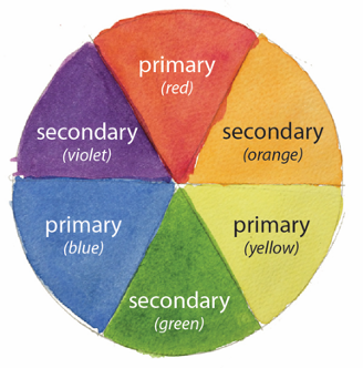
There’s the BASIC COLOR WHEEL, with the PRIMARY (red, yellow, blue) and SECONDARY colors (orange, green, and violet), like the one below.
The three primary colors are so called because they are the “first” or fundamental colors. They are the colors from which all other colors are created, and no other colors can be mixed together to create them.*
The three secondary colors are made up of two primary colors: red + yellow = orange; red + blue = purple (or violet); yellow + blue = green.
That is pretty much it for our present purposes. (There is much more to color theory, of course, and if you want to get into the physics weeds about color, that’s GREAT! Check this out: https://www.sciencelearn.org.nz/resources/47-colours-of-light This presentation is from New Zealand, meant for school kids, so it is simple, clear, and well done).
This exercise is going to give you great practice in three areas:
- You’ll be working with washes. I debated long and hard with myself about whether to offer this exercise or the wash exercise as Exercise 1. This is because both are so very basic to watercolor. In the end I elected to put the Color Wheel one first because it applies across all kinds of art, not just watercolor. Anyway, now is a GREAT time to check out Exercise 2 Washes, especially if you are not yet familiar with washes.
- This is a great exercise in color mixing. You’ll be using the colors in your own palette to create all your colors.
- btw, there is often confusion here because of our description of the color wheel. We say things like, “blue and red make purple”. Yes. That is true. But sometimes when we try mixing those colors we come out with some strange stuff—especially with purple! The problem arises because our color wheel talk is theory. Pure color is theoretical. Our paints, however, are anything but pure color! All of them are made from a wide assortment of pigments, dyes, and binders, and they vary endlessly. The purest color we have is yellow, but you need do nothing further than to look at samples of cadmium yellow and lemon yellow side by side to see that neither is “pure”.
- In practice, then, most of the time you will be mixing colors, and your eye will become the arbiter of your color quality. How you mix will be determined on the colors in your personal palette. I recommend testing colors on scrap paper to see what your colors are doing before you apply them to the “real” wheel. For tests to be as valid as possible, you always want to do them on watercolor quality paper.
- It’s great training in interpreting HUE. Hue is the term we use for color. “What color is that thing over there?” When we ask that question, we are talking about HUE. We will be striving to make the hues as close to clear and accurate as possible. That is to say, our green, for example, should not be too yellow or too blue but half-way between. How do you know when it is? I don’t have a cut-and-dried answer for that question. But I can say that the more you practice and observe, the more this awareness will develop, and you will know it!
OK, now let’s make a basic color wheel.
To make the wheel, first lightly draw a circle on your watercolor paper. If you have a compass, fine. If you don’t, you need not run out and get one. You can trace any round object. Just don’t make it too little. A teacup saucer is a good size. The teacup itself is too small.
Now divide your circle into six wedges, as in a pie. Each “slice of pie” will contain one of the six wheel colors. You will be painting your slices with washes. For these washes, I like the paper surface not too wet, as it is a small area, and you want your color to flow well. And you can control the intensity of your color, too. Let each slice dry before moving to the next one. Continue on around the pie till all the slices are filled in.Start by making a circle on your paper. If you have a compass, great! But don’t run out and buy one if you don’t. You no doubt have things around the house that will do. A teacup saucer is a good size. (The teacup itself is too small).
Now put a dot in the center of your circle and divide your circle into 6 equal wedges (eyeball measurement is fine; just make sure each of your lines goes through your center point). OK. You are ready to paint. Start with the primaries. Make each of your washes separately and let it dry before doing the next one. (I hope you looked at Exercise 2 Washes if you aren’t already familiar with them). I like to start with a surface that isn’t too wet so that the paint flows in smoothly and stays strong.
Make your way around the circle in this way till you have all six colors in place.
In the color wheel pictured above, I added text (in Photoshop) that identifies primary and secondary colors. When you make a really good color wheel that you want to put in your reference file, you may want to add these labels, too. You can write them within the color areas with markers and a white pen on the darker colors, or you can add them in the margins next to the colors. (You can also Photoshop them, of course, as I did). Labeling doesn’t have to be fancy—just clear and legible. (btw, the placement of red at the top is arbitrary, but it seems to be the most common orientation of the wheel).
Now for the main event.
This time you’ll be making a more complex color wheel. Take a look at the image below.
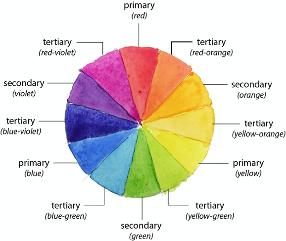
This wheel, as you can see, is a “build-out” of the first one. This one is prettier, don’t you think?? Looks more like a real rainbow, because as you know, the rainbow doesn’t have sharp lines from one color to the next…it BLENDS in analog fashion from long-wave red to short-wave violet so it contains ALL the colors! This color wheel does actually have sharp lines, of course, but the variance of color is much more gradual, thus the “look” starts to approach that of nature’s rainbow.
Okay…back to the project. In this exercise you are going to be creating TERTIARY colors. As you know, the SECONDARY colors are made up of the two PRIMARY colors on either side of it in the BASIC COLOR WHEEL. The TERTIARY COLORS have a PRIMARY color on one side and a SECONDARY color on the other. So they are made up of those two colors. (A good hint for making your tertiary colors…that is, start with the colors you have already used for the primaries and secondaries…you know what they are because you’ve kept notes, right?? 🙂
Draw a circle on your paper, add a center point, and this time, instead of dividing into 6 “slices of pie”, make 12 slices. You’re going to want to make your circle no smaller than in your previous wheel, maybe a bit bigger—use a salad or dessert plate rather than a saucer. That’ll make it easier to work inside the smaller pie slices you are creating. Then you are going to put in the PRIMARY colors, then the SECONDARY colors, and finally the TERTIARY colors. You’ll be using washes, as before.
This is not as easy as you may think it ought to be. If you haven’t made a 12-part color wheel before, don’t be surprised if your first attempt doesn’t work. To say that getting the colors right is challenging is an understatement. (See my comment above, under the headline This is a great exercise in color mixing.) Do keep at it. You will get there. And when you do, you’ll have created a thing of beauty!
So you are a color-wheel expert now? Great!
Don’t rest on your laurels! Give yourself some new challenges. Try making alternate versions, using different levels of intensity in your colors. Try, for example, one with a light pastel palette. By the time you do a few of these, you will have made big strides in controlling your colors!
* When we speak of theoretical pure color, it is true that the primary colors cannot be created from mixes. In practice, however, sometimes this can be done, or at least approximated. This is because, as mentioned before, none of the paints we use are actually pure color. But some combinations can come close. One example: there are some vivid pinks that have names with the word “rose” in them (rose madder, a very common color, is not one of them). Certain yellows can be added to those, and they can look close to a pure red—good enough for a nice color wheel, and possibly better than the reds in a typical palette.