The wash is the most fundamental technique in watercolor. It is primarily beautiful washes that create the classic look that all of us watercolor lovers recognize and admire.
There are lots of kinds of wash. I’m going to show you a few, and after you read through this exercise, I invite you to try them out. Become a kid in second grade art class again and play with your paint, water, and paper! See what you can discover for yourself!
But first things first!
To make washes (or anything else) you need three ingredients: paper, water, and brushes. I’m going to talk a little about the third.
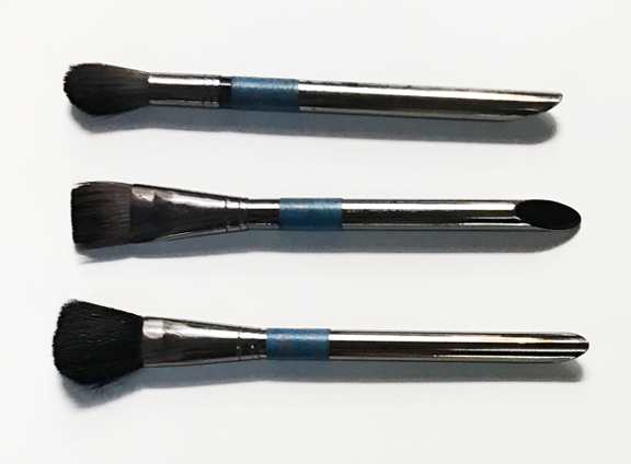
Here you see three kinds of brushes, and they are the ones I use the most for making washes. I like to use the largest brush I can because the essence of a good wash is being able to work quickly and refrain from painting “over and over”. You want to lay down your strokes and leave them—that is, not to go over them again and again. And to do that you need a brush that fills your spaces quickly.
ROUND: The top one is a large round (#16). It works well for smaller paper formats, and for small areas on larger formats.
FLAT: The second one is a 1” flat brush. I like it for, let’s say, 12” x 16” and larger formats. There are also flat brushes in several sizes, and they are fine.
MOP: The bottom one is called a mop. It’s big and really thick, and it holds a huge amount of liquid. It has a fuzzy, rounded edge, so it’s quite terrible for making sharp edges, but it is better than awesome for making beautiful washes over a large area! It’s probably a bit much for anything less than an 18” x 24” format, though. (It might have an application in a smaller paper format if your wash area covers most of your sheet, for instance, in a “big sky” landscape.)
Ok, now let’s look at some washes. (In all these examples, the color I used was French ultramarine blue).
Washes on a wet surface (wet-into-wet)
You will hear watercolor aficionados talk a lot about “wet-into-wet”. All this means is that wet paint is added to an already wet surface. The wet surface can be paint or plain water. But that’s really just the beginning. There are lots of ways to do wet-into-wet. Here are some examples:
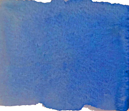
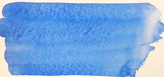
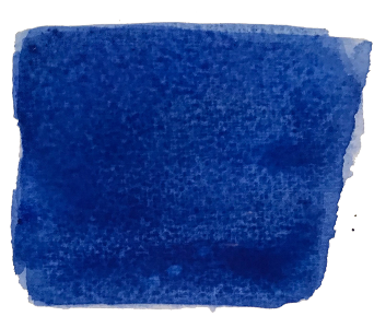
This wash has a nice strong color, and it is smooth and consistent across the paper. Washes of this kind are nice when you want a large area of consistent color, like in a clear blue sky.
To make this wash:
- The first thing to do is to mix enough paint on your palette to make the entire wash without having to re-mix. The paint-water ratio was pretty strong on the paint side in this mix, so that the color of finished wash was quite intense.
- Stroke some clear water onto your paper.
- When the wet area is still somewhat glossy, start adding paint, making one stroke at a time, placing each stroke directly under the previous one. Dip your brush into the paint before each stroke. (I used the 1” flat brush, and I stroked the wet area quickly so that the area would not dry too much before I finished). DO NOT GO OVER YOUR STROKES. ONE SHOT IS ALL YOU GET! (see “SOME WATERCOLOR PHILOSOPHY”)
- At first your painted area may look “strokey” or “stripey”. Don’t worry! Just let the wet paint and water move around and blend as it wants till it is dry. You should end up with a smooth, clean wash.
When you try this a few times, you might observe that the paint behaves differently each time. Be sure to pay attention to these details, and try to implant into your mind what you are seeing. (Taking notes right on your paper as you work can be a big help!) How wet your paper is, and how watery your paint is (watery paint will dry a lot lighter than it looks in the palette), have everything to do with the way the paint mixes. You’ll see when you do your experiments!
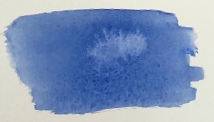
Here’s another kind of wet-into-wet wash:
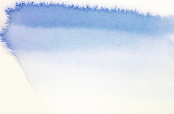
To make this wash:
- When you wet your paper you want it to be quite wet, nearly a puddle.
- Make your mix in your palette. Unlike in the first wash, this time you make your brush strokes from a single big “helping” of paint. As in the first example, you’ll lay down each stroke one under the other.
- If you like the fuzzy edge effect, you want to be careful not to put too much paint in the wet area. This effect happens when the paint moves as far as it can, but because there isn’t enough of it to reach the outer edges, it will settle and form an edge as it dries.
If you like the fuzzy edge effect, you want to be careful not to put too much paint in the wet area. This effect happens when the paint moves as far as it can, but because there isn’t enough of it to reach the outer edges, it will settle and form an edge as it dries.
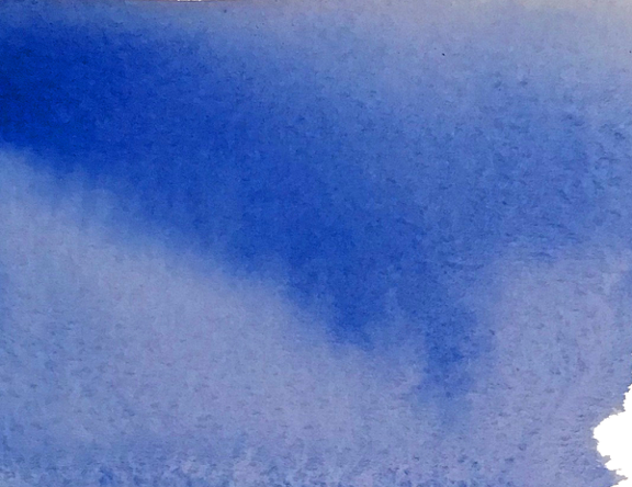
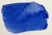
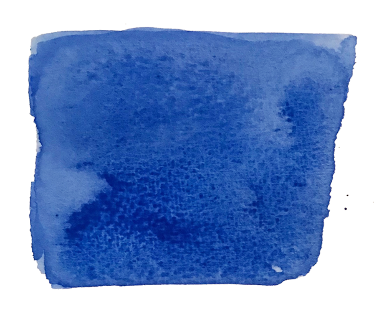
Here is another wet-into-wet.

This one is similar to the first one, except that its color is generally stronger but still transparent. The only difference is the ratio of paint to water in the mix.
To make this wash:
- Make a mix on your palette with a high ratio of paint to water.
- Wet your paper with clear water, and then wait for it to turn from glossy to matte—as it dries, it will become less shiny.
- Dip your brush into the mix for every stroke, placing new strokes right under the previous ones. Again don’t stroke the same area more than once. You really have to work quickly with this one because the drying process is quite far along before you put paint down. At this point the paint is still wet enough to blend, but (unless the atmosphere is very humid), it won’t stay that way long.
- For an even stronger color, you can try dipping your brush directly into the paint for each stroke. For this, your brush needs to be just wet enough to gather up the paint. Just be aware, though, that you have to avoid picking up big blobs. (This isn’t generally a problem with pan paints, as they tend to be more solid than paint from tubes).
- You might see puddles of extra paint accumulating on your paper. If you don’t want to leave them (and risk an unwanted bloom, more about which appears below), you can lift them out with the point of an almost dry brush. Dip the point into the puddle of paint and let the brush’s capillary action absorb the extra liquid. The end of a bit of kleenex or paper towel will work, too.
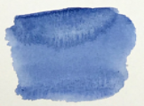
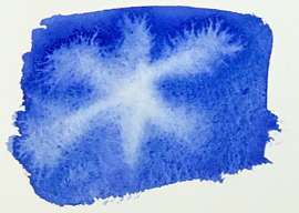
This wash is fun to make and can give you beautiful, if not quite predictable effects:
To make this wash:
- Start out just like the others, with a mix of paint on your palette, or you can dip paint directly from the paint well of your palette, but this time you’re going to violate the no-extra-strokes rule.
- Your wet paper wants to be “glossy-ish”. That is, not bright wet glossy, but not damp either—somewhere in between. Quickly lay down your strokes.
- Then while this layer of paint is still wet, lay on another stroke of strong color at the top (you can do two, if you like, as long as you can do it quickly enough). The trick here is that the paint in the added stroke needs to be less watery than the underlying ones. This will make a bloom less likely to form.
- Then tip your paper up and let that brilliant color move down. If it is still very wet you may have to wait a little. Or you can try wobbling your paper around a bit. All the while, though, it is drying, and eventually it will stay put. How it will settle is not totally predictable, and that’s part of the delight!
This is really a fun wash to do because you can create some amazing effects. I like it for stormy skies, for instance, or fog, or for disturbed water surfaces, or for creating the illusion of great distance with blurry tree lines or mountains. You’ll discover others, too.
Wet-on-dry wash
This kind of wash is done by simply putting wet paint down on your dry paper. Again the intensity of your color (also called “hue” or “chroma”) depends on the ratio of paint to water. (BTW, hue and chroma are art-nerd words for color; your friends will be impressed if you toss them around in casual conversation!)
This wash looks smooth and “washy”, but color is usually more intense, and you can control the sharpness of your edges. This kind of wash works really well in small areas where you might want to suggest, rather than overtly show, detail. If you’d like to see how I have used this kind of wash in small areas, have a look at the paintings of Grand Canyon.
Now about those blooms
Blooms are also called watermarks, blossoms, cauliflowers, back flows, etc.)
These are terms, some a bit sardonic, that people use to describe those strange-looking blobby marks that sometimes appear in washes, like those in the pictures above.
For beginners, these tend to happen by accident and are unwanted. They occur when new paint is added to an already-applied layer of paint that is in the drying process. The new wet paint spreads into the underlying partially dried layer until reaches a point where the underlying layer has dried and formed a barrier. The still-spreading new paint can’t spread beyond that barrier, so it piles up against it and forms those dark lines and ridges.
Don’t worry about these. The best way to learn about them is to practice! Experiment! And as you do, keep a close eye on how watery your paint is and how wet your paper is. You will discover a lot about how the dynamics of water/paint and wetness/dryness work, which is key to avoiding them if that’s what you wish to do.
That said, however, not all blooms are unwanted. Many fun and interesting effects can come from intentionally induced blooms. Here’s one:
Here is a really useful wash.
It is a double wash. One of its primary uses is for areas where you want very rich, dark color. Using the double wash will allow you to achieve this depth of color, even as you maintain transparency (that is, you are still aware of the white of the paper underneath the color).
To make this wash:
- On the left is a wet-into-wet wash. Make this wash the same way you did in the first one in this exercise.
- Let this wash dry completely.
- When it is dry, repeat the process. That is, make a second wash on top of the first one. Don’t worry about losing the first layer. The reason you must let the first layer dry thoroughly is that the color remains stable.
This double wash is a technique that has its own name. Glaze. In this example the glaze is monochromatic, and its purpose is to produce that dark, intense color. But you can glaze with different colors, too, and in the exercise on glazing, we will have a deeper look at this technique.
Okay, have at it—and have fun!