There are as many approaches to painting a portrait in watercolor as there are watercolor styles. For this piece, I wanted the immediacy and freshness of laying down the paint very quickly in just a few thin washes.
My color palette for this piece: Cadmium Yellow, Yellow Ochre, Cadmium Orange, Opera Rose, Alizarin Crimson, Burnt Sienna, Warm Sepia, Cobalt Blue. You don’t need these exact colors. You can use whatever you have in your palette that is close, and if you have a more limited palette, you can mix colors that are harmonious, though they may not be exactly the same.
Optional items: tracing paper, graphite stick or #2 pencil, tape.
DRAW! (A digression)
Even though I primarily teach painting, I strongly advocate drawing as much as you can. Keep at least one sketchbook, preferably one that is small enough that you can have it with you at all times. I have lots of small ones that I stash around my environment: kitchen, car, backpack—anywhere I might end up with a little time to draw. (I have a large sketchbook in my studio that I use to design paintings, but that is not part of this story right now).
Draw whenever you have a few minutes that you would otherwise waste. Draw anything, everything! Landscapes, buildings, utility poles and wires (these are fun!), gardens, trees, flowers, tables, chairs, boxes, kitchen tools, hats, food, your own feet—anything! Just keep in mind that whatever object you are drawing, what you want to do is to forget about what the object is, and rather, focus on its basic elements: its component shapes, the sizes and positional relationships among those shapes, its lines and angles, and its patterns. The best practice you can get is to draw very simple things: a single leaf, a lone pebble or small rock, a twig, a plate, a ball, and on and on. One small object will allow you to access its basic elements without the complication of composition—you don’t need that when you are working to improve your drawing. Certainly you can work on composition, too, but never forget about these basics. It’s like the world-class pianist who never stops practicing scales.
Certainly you should try drawing faces and figures. The approach is exactly the same—that is, focus on shapes, angles, and patterns, and relationships among them. For example, forget that those two things smack in the middle of the head (of a straight-on face) are eyes; look at them as shapes that look something like almonds. How far apart are these “almonds”? Maybe about the same distance as the length of the almond shape itself? Now look the shapes of the light and shadow areas under and between those almonds, and notice how big, wide, and long they are, where they lie in relationship to the almonds. These shapes will end up forming a nose. And on and on. Don’t worry if you don’t always achieve good likenesses. Just keep working at it. You may at some point surprise yourself that you start making something that looks like a believable face. This comes in very handy when you want to create a portrait!
A Cute Trick
Try this cute little trick to get a good feel for how a human face is arranged and proportioned. Take a sheet of plain 8.5” x 11” paper, and on the long side, fold it in half. Then fold it in half again. Now unfold it. You’ll have three fold lines across the paper. The center fold line is where the eyes are. Draw them in. The lower fold line is where the upper and lower lips meet. Draw these in, too. The upper fold line is where the hair begins. Draw a hairline there. The eyebrows will be a little bit below the halfway point between the center and the upper fold lines. Draw those. The top of the paper is the top of the head, and the bottom of the paper is the lowest point of the chin. Draw the outline of the head, a partial ellipse whose upper edge just skims the top of the paper. Now you can draw a jawline with the lowest point of the chin just shy of the bottom of the paper. This ought now to look like a face.
Is It Cheating?
Not if it works! It’s not necessary for your portrait to be an exact likeness, and if you prefer, for now you can just do any face; as long as the proportions are reasonably close, it will look like a face (do the Cute Trick above if you want to be sure of those proportions). However if verisimilitude is important to you, and you aren’t able to achieve it just by freehand drawing, here’s something you can do. If you have a computer or smart phone and a printer, print out a copy of your reference photo at the size you want for your painting. Then lay a piece of tracing paper over your copy and trace the main features of the face. No need for a lot of detail; just the outlines of the eyes, eyebrows, a few lines for the nose, the lines of the upper and lower lips, and the line where the two lips meet if the lips are closed. In our reference image, (see below) the lips are parted in a smile, so you would trace the shapes of both the upper and lower lip, and you’ll probably want to put in a couple of lines on either side to define where the row of teeth ends. Tracing with a red or other bright-colored Sharpie is good. You’ll see why in a minute.
Now turn your tracing paper over, and with a soft-lead pencil (#HB or #2), or a graphite stick, color over the tracing lines on the back side. When you have all the lines covered, turn the tracing back over to the front side and lay it down on your painting surface. Tape it lightly at the edges to keep it in place. Now trace again over the Sharpie lines. You can see now how the alternate color is more visible. Pencil lines can be easily lost because of the graphite you just put on the back. You’ll want to use a little more pressure than you would if you are drawing directly on the paper, because you have that tracing paper layer to get through to reach the painting surface (lift up a corner of your tracing for a moment to see if it’s working). When you have gone over all the lines, take off the tracing, and you’ll see the face in light pencil. Don’t worry about the pencil lines showing. If they do that’s ok in watercolor, but more than likely they will disappear when you add your paint. And if by some chance some of the lines get a little too heavy, just take a kneaded eraser or Pink Pearl eraser and take away some of the line.
STEP 1. DRAW THE BASIC FEATURES OF THE FACE.
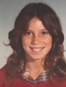
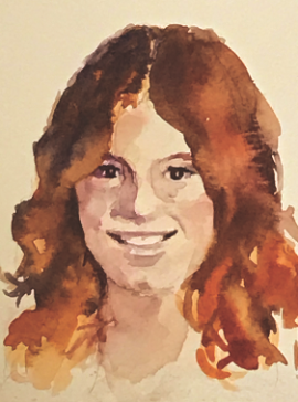
This is our reference image for this demo. It is a photo of my daughter Erika when she was twelve years old. I came across it recently while going through old photos with the aim (probably a vain one!) of putting some order to them. Erika is now an adult and the mother of two daughters—but she still has the same lively dark eyes, mischievous smile, and wicked sense of humor, so I wanted to try to capture her with this loose and light technique.
This image was done on an 8” x 10” area on a 9” x 12” sheet of Arches paper. I wasn’t concerned that my finished piece look exactly like the photo, so I only spent a minimal amount of time on the drawing, but I think it’ll do. I want only that the portrait is recognizable as Erika, and that her essence and spirit are present.
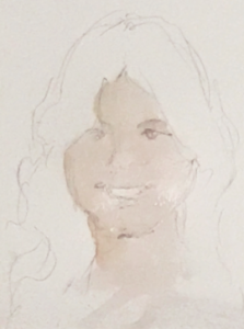
STEP 2: FIRST WASH
In the image above, you see the underdrawing and the first wash that blocks in the skin areas. I used a #16 round brush, mixed the color on the palette (Yellow Ochre, Opera Rose, with a touch of Cobalt Blue—as always, you try and test your color on watercolor paper before you apply your paints. Scraps are great for this.) Your paint should have a thin, watery consistency. When you like your color and are ready to paint, apply your wash (for this wash, my paper was dry). Work as quickly as you can, and don’t go over the painted area more than once. It’s hard to resist the impulse to “guide” your paint with multiple strokes as it is drying. But do resist. Please! Let the paint move around as it likes as it dries. Leaving it alone will avoid an unpleasant “overworked” look, and while you may not be able to tell exactly what will happen when it’s dry, whatever it is will be fine. (A little aside: being willing to relinquish some control is a great advantage in watercolor painting!)
Now let this layer dry completely.
STEP 3: SECOND LAYER, DEFINE THE FEATURES
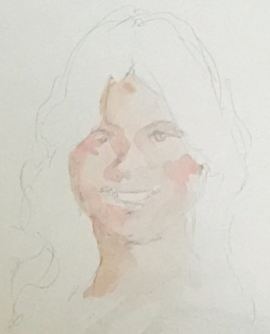
Now that the first layer is completely dry, you can begin to shape the features and add some shape and the illusion of dimensionality to the face.
Check Your Light Source.
Any time you are developing a painting, you want to determine what direction your light is coming from and how strong it is, as that will tell you where to put your lights and darks, and how your shadows will look. Look at our photo of Erika and note that the light is coming from the right, slightly above the head. The light is fairly close to her, which you can tell because some of the shadows, especially those on the left side of her face, are quite dark, with definite edges to them. On the right side, where the light is stronger, the shadows are much smaller and lighter.
Now go ahead and make a paint mix on your palette with the same three colors, but this time you’ll need more Opera Rose than Yellow Ochre, and only the slightest touch of Cobalt Blue. Again your mix will be watery and thin.
Now, again with very quick strokes and without going over any wet area with more than one stroke, add color where you see shadows. These will be basically just shapes on your paper, but they are very important because the location, size, and shaping—if you will!—of these shapes will define the nose, the eye sockets, the cheek bones, and the chin. (Another little aside: we talk a lot in watercolor about negative painting—that is, to create an object of a lighter color by painting around it with a darker color. You can see here that it is the darker shape under the chin that is defining the shape of the chin itself—a good example of negative painting!)
Because of the location of the light source, your shadows on the right side will be larger than those on the left, and in subsequent steps, they will become darker as well.
STEP 3: ADD THE HAIR
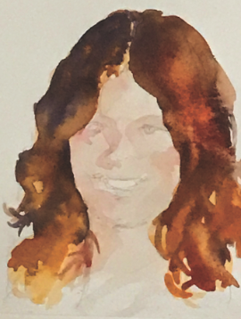
This was the most fun part of this piece for me. This time we are going to load the wash up with color! And this time we aren’t going to mess around with mixes on the palette. We are just going to paint!
Well, let’s not move too fast! If you wish to read through this section first and try a little practice, there’s no harm in that. And when you are ready to paint the hair for real, here’s what you do. First lay down some clear water on the large area you want to cover (you don’t need to wet those little flips and tendrils, only the main body of color surrounding the head and down into the shoulders. The wet area should be glossy, but not puddly. If it looks too wet, let it dry a little. Walk away if you have to for a few minutes if you’re getting too impatient.
OK. Now that the wet surface has just the right glossiness (how do you know when the glossiness is “right”? Not an easy question to answer; it’s something you learn from experience, but if you don’t have much of that, go ahead and practice a little bit first). Now get some Cadmium Orange on your brush. Don’t be shy! Get lots of color onto that brush! Drop the color into the wet area, stroke it only a little—quickly, now!—and let it run. Then in different parts of the hair—look at the reference image to see where the highlights and various colors are—quickly add some Cadmium Yellow, some Burnt Sienna, a small amount of Alizarin Crimson, and in the very darkest areas, especially on the top right side and right next to the face, Warm Sepia and a little Cobalt Blue. You can stroke a little bit to guide some color into those little flips and tendrils we didn’t wet at first, but mostly you will just drop the color in and let it do its thing. If you get some blooms, don’t worry. They will probably add some nice texture to the hair.
The hair in this piece was done in a single wash. And to get it to happen as it did, quick strokes and not too many of them created the effects. (BTW, because of the way it was created, I will never get this exact look to happen again, but I will get others, very similar, that I will like as well!)
Let the hair dry completely.
STEP 4: FINER POINTS: EYES, EYEBROWS, CORNERS OF THE SMILE, SHAPING OF LIPS
The darkest colors are used here for the eyes and eyelashes. For the eyes, I mixed Cobalt Blue and Warm Sepia on the palette; for the eyebrows, Burnt Sienna and Cobalt Blue, but not mixed on the palette. For these fine details—the eyes and eyelashes, the brows, and the dark corners of the smile—you will, in essence, be drawing with your brush. And for that you need a brush with a good sharp point and a little bit of “spring”—springiness being the tiny bit of resistance you feel when you bend the brush hairs back and let them go again). This sort of brush doesn’t have to be a teeny size; the brush I used to make these details was a #4 round (this is the smallest round I have, and it is plenty small enough for almost all my small details. Its key feature is its very good point). (Another little aside: brushes wear out, and your favorite brushes get used a lot. So when you start having trouble getting the precision you used to get, it isn’t you! It’s probably the point of your brush going mushy. Get a new one.)
So now you want to look at the traced pencil lines you made for the eye shapes and the eyebrows, and where the row of teeth end inside the mouth. Carefully draw in the small lines indicating the lashes with your best brush point. The line can be, and probably should be, a little bit shaky, as a clean, sharp line will look out of place in this painting style, and the eyes may appear unnatural. When you paint in the eyebrows, you can start with a wettish Burnt Sienna, lay it down, then touch the wet Burnt Sienna with an ever-so-small dot of Cobalt Blue, and let the colors mix as they will. This will give a less monotone, more natural-looking brow. Notice a little shadowing at the edges of the eyes. Adding touches of shadow (the same color mix as in Step 2) in these spots will create a little depth and more natural-looking eyes.
You will want to take particular note here of the mouth and lips. Take a good look at Erika’s mouth in the reference image, and see how light and shadow are working on the lips and teeth. Under ordinary light, a person’s upper lip always appears darker than the lower lip. In this portrait I left the lips a natural sort of pink, as at age twelve, Erika had not yet started to wear make-up. The color mix for the lips was the same as in Step 2, just a tiny bit pinker than that for the rest of the skin. The upper lip is a little bit darker, and that was done by barely touching the wet area with a teeny spot of Alizarin Crimson. And notice in the image the very slight shadow on the teeth, especially on the right side. Novice portrait painters are often baffled by the mouth. They can get the shapes of the lips right, the teeth right, even the little dark spaces at the edges of the smile right. And still the mouth can appear sort of unnerving, and sometimes even a little ghoulish. The problem is nearly always that the artist did not notice the subtle shadowing on the teeth. This shadow is formed by the upper lip extending over the teeth, and you’ll want to add a tiny little shadow just like that to the teeth in your painting (again the same color mix). Also remember that the row of teeth is curved, not flat, so as the teeth curve into the interior of the mouth, the back ones will look darker than those in the front. To do all of this takes literally two or three tiny strokes on the right, or darker, side, and maybe just one on the left, and the mouth and teeth together become a lovely warm smile.
In the same way, the lower lip casts a shadow on the chin, and that shadow also helps to define the shape of the chin.
STEP 5: FINISHING DETAILS AND A LITTLE REFINEMENT
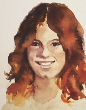
For all intents and purposes, I could have stopped at the last step and declared the painting finished. At that point I had pretty much done what I wanted to do—paint the face in quick washes, and capture, if not an identical replica of Erika’s school photo, the lively soul of this young girl, and have it like enough that folks recognize her. However, a day or two after I did the piece, I took another look at it, and I saw that I had aged her about five years. The main culprit in the premature aging, I felt, was that her face looked a little fuller than it does in the reference image. So I slimmed it down by reworking the cheek and jaw lines on either side of the face with colors from the hair. I didn’t do much, just enough to make the face narrower, and now she looks a bit younger. I could no doubt have done even more, but I think it’s okay.
(Another aside: It is very common that paintings are not 100% for-sure finished! Mine seldom are! There are always things you can do. But sometimes those can harm as well as help, and often, it is better just to consider our paintings finished when we say they are finished!_
And here is a little coda: I made another addition to the painting that had nothing to do with the painting per se, and everything to do with Erika’s genes. Her prominent chin dimple is a very strong facial feature on her father’s side of the family. Every member of that line has it. Her father has it. Her uncle had it. Her grandfather had it. She has it. Both her girls have it. And people think it is cute and charming! And while I didn’t entirely miss it in the portrait, it is so emblematic a characteristic that I thought it needed a little more attention from my brush! So you see that a little more darkish shadow (that same Cobalt Blue and Alizarin Crimson mix) was added to deepen the dimple.
OK. Now go paint!