In this exercise you will be painting a simple form, a lemon with a leaf on its stem and a shadow underneath it. As uncomplicated a subject as it may seem, it will give you plenty of opportunity to put into practice a whole lot of important principles. Some of these apply to painting in general, such as establishing light direction and how that affects shadows; how to use complementary colors to create interesting and dramatic effects; how to create the illusion of shape; and others. We will also touch on principles specific to watercolor, such as creating washes, lifting paint to create textures and highlights, charging (wet-into-wet) and glazing (applying color over dry paint).
My color palette for this piece: Lemon Yellow, Cadmium Yellow, Cadmium Orange, Sap Green, Phthalo Blue, Cobalt Blue, Opera Rose, and Burnt Sienna. You can use whatever you have that is close, and if you have a more limited palette, you can mix colors that are harmonious, though they may not be exactly the same.
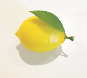
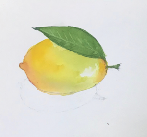
STEP 1. EVALUATE YOUR IMAGE.
Above is our photographic reference, a lemon with a green leaf attached to its stem. It is sitting on a white tabletop and has a nice, strong shadow. Some things to notice about this image and pay attention to as we paint:
- Light source and direction. There are actually two light sources here: a dominant one, above and a bit behind, slightly to the right of the lemon, so that the shadow on the table is shifted slightly to the left. There is a secondary light source that is causing the little white highlight just under the leaf. The secondary light source is not as strong as the dominant one, but you can see a faint second shadow under the lemon, most noticeable on the right side. These kinds of compound shadows can be very interesting, but for the purposes of this painting, we are going to ignore the second shadow.
- Light strength. The (dominant) light source in this image is either very strong or very close to the lemon or both. We know this from the sharp, crisp edge of the shadow. We will make our shadow like this, too.
- Shadows. The two types of shadows we deal with in painting are “cast” shadows and “form” shadows. A cast shadow is one caused by an object throwing its shadow onto another surface, object, or objects, and occurs directly opposite the light source. A form shadow is one that reveals the shape of an object from where light hits it and where it doesn’t.
In our lemon photo, we have both types of shadow. There are two cast shadows: the grey one under the lemon on the white surface of the table top, and the one cast by the lemon’s leaf onto the skin of the lemon. The cast shadow on the tabletop is grey, and the cast shadow on the lemon surface is multicolored, as it picks up color on the surface of the lemon and also receives reflected color from the leaf.
The form shadow is on the fruit itself and is strongest in the area that is opposite the light source. This shadow is curved because it follows the curve of the lemon, and it is darkest at the point that is farthest from the light source(s). You’ll notice that the darkest part is not directly adjacent to the shadow on the tabletop but just above that point. That is because there is a bit of light from the white tabletop thrown onto the bottom of the lemon. Again, this information helps our eye interpret the rounded shape.
OK. Now we are ready to paint!
STEP 2: DRAW YOUR IMAGE ON YOUR WATERCOLOR PAPER.
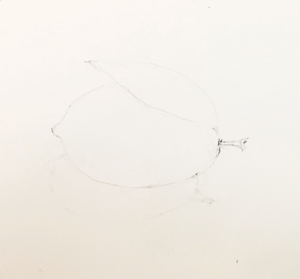
Lightly draw the outlines of the significant shapes in the image. Your #2 pencil should be fine, but do avoid heavy lines (if they get to be a bit much, lighten or eliminate them with your eraser). Most pencil lines will disappear when you paint, but if a few light, deft lines remain visible, no worries. Just leave them; they can add a charming spontaneity to watercolor paintings. The masters never worried about them; they are all over works by Homer, Sargent, and others. Some painters even scribble little notes and make test blobs on their paper and leave them—again, these create a sense of immediacy and intimacy, as if you are peering—politely, of course!—over artists’ shoulders as they work.
(Helpful hint: if you aren’t in the habit of drawing, why not draw the lemon on some scrap paper a few times before you try drawing it on your watercolor paper. Be observant about what you are doing, so that when you get something you like, you can repeat what you did on your watercolor paper. (btw, I advocate drawing a lot. Even if you don’t think you draw well. Or rather, especially if you don’t think you draw well! As with any other skill, with practice you will get better, and better drawing begets better painting!)
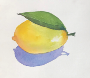
STEP 3. THE FIRST LAYER, A LIGHT YELLOW WASH
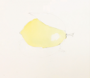
This wash was done by first brushing on clear water everywhere inside the lemon shape except for that white spot that will become a highlight. The wet surface should be glossy but not puddly. Then add Lemon Yellow, quickly covering the entire surface with color. I also added a tiny touch of Cadmium Yellow on that upper curve to the left of the leaf and let it blend into the wet Lemon Yellow. Let this layer dry completely before moving to the next step. The technique of adding color to wet color (it can be the same color or a different color) is called charging or wet-into-wet.
STEP 4: BEGIN THE LEAF; START BUILDING SHAPE OF THE LEMON.
This will be done in several phases:
- First the leaf. Wet the entire leaf and stem area as in STEP 2. Flow in a wash of Sap Green. Let it dry. If this green does not match the intensity of the yellow of the lemon, do another wash on top of the first one. The technique of painting on top of dry paint is called glazing. (NOTE: You might ask, why do I have to do this when I can put a lot of paint down and get it done in a single layer? One of the qualities most appreciated about watercolor is the brilliance and sparkle that comes from seeing the whiteness of your watercolor paper through transparent paint. You get intense color and at the same time retain transparency by laying multiple thin layers of color on top one another till you get the intensity you wish, each layer drying before the next one is added. To try to achieve maximum intensity in a single layer is not advisable, because painting with thick paint risks losing the white of the paper underneath).
- When you have the green you want, and it is dry, you will now paint the veins of the leaf. Well, you don’t actually paint them; more precisely, you unpaint them. To do this, select a brush with a very good point and dampen it. Then “draw” the center line of the leaf, and each of the veins, by lifting out the color. Do this one vein at a time, wiping your brush on a paper towel after each stroke and re-moistening it for the next one. You may need to lift out in the same spot more than once to get enough contrast to see the veins well. This is a painstaking step, but if you exercise your patience, you will have nice crisp, clear veins.
- Now let’s start shaping the lemon. By now I’m sure you get that you need to let every layer dry completely before adding the next one, right?? Ok, then, now wet the entire yellow wash area again, still avoiding the white highlight, but don’t let it get too wet this time—the surface should look more damp than wet (matte vs. gloss). Flow another wash of Lemon Yellow right on top of the first one, again letting the white spot stay white. Now add just a little Cadmium Orange on the upper left curve of the lemon. Apply the color with the point of your brush, tracing the color right along the edge of the curve in just one or two strokes. Let the color move toward the center. It should be stronger at the outer edge and eventually disappear into the pure yellow. Let that dry completely.
- Wet the same surface again. This time you will add some Sap Green, using more of the body of your brush, to the area just under the leaf, and along the bottom of the lemon. Again, use just two or three strokes. The color will be most intense where your brush contacts the paper, so position your strokes strategically. Be aware that the very bottom of the lemon should be yellow. Once again, let the color move outward from the stroke; the green will soon fade into the yellow. Let this dry completely.
NOTE: you may now have figured out why we wet the entire surface of the lemon when we are only going to add small amounts of color, and that mostly in peripheral areas. This is because we want a soft, gentle color transition, and that requires a large wet area for the added color to spread out in. But because we don’t add enough color to flow over the whole area, eventually the added color thins out and disappears, making a soft, even transition.
STEP 5: A LITTLE MORE SHAPING
We will now add a little more color to continue developing the shape. Wet the surface of the lemon again, the same way you did in the two preceding passes. This time you will add a small amount of Opera Rose to the little nub on the left, along the bottom left side edge, and right next to the stem. Again you’ll paint just along the curves and let the color drift into the wet area. You’ll notice that the Opera Rose turns slightly orange, and as it flows toward the center it intersects with the green you added in the last step. The green takes on a slightly richer look as a result of the complementary color’s influence (you’re right…the complementary to green is red…but orange is right next door on the color wheel and functions similarly).
STEP 6: PAINTING THE BOTTOM SHADOW, AND CONTOURING THE LEAF
So now the fun really starts! Let’s look again at the shadow in the reference photo. It’s grey, isn’t it. Well, sometimes not taking a photo absolutely literally could result in something interesting. Complementaries work well to enhance one another, and I liked the idea of using the complementary color purple to bring out the brilliance of the golden yellow lemon. The grey would have been okay, but probably a bit dull.
To make this shadow, paint a layer of clear water inside the sketched shape of the shadow and drop some Cobalt Blue into the wet area. While the Cobalt Blue is still wet, introduce a small amount of Opera Rose into the wet area and let it run as it wants.
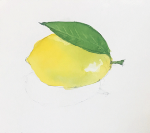
STEP 7: LAST BUT NOT LEAST, FINISHING THE LEAF, ADDING THE SHADOW UNDER THE LEAF
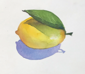
Look at the shadow under the leaf. You’ll see that it is a layer painted on top of a dry layer, that is, a glaze; and the glaze is made of blended colors applied into a wet area, that is, charged (or wet-into-wet).
Here’s what you do: if you would like to be sure of putting this shadow in the right place, it is fine to lightly draw the shape of the shadow on top of your painted layers as a guide. Then go ahead and paint the area with clear water, still avoiding that white highlight. Then drop some Sap Green into the left end of the shadow and let it move along in the wet space. Be sure you don’t put in too much green because the flow should ebb out as it moves to the right. Then, while this area is still wet, drop in a bit of Cadmium Orange just at the tip of the leaf shadow, and let this run.
Now the finishing touches on the leaf. When the shadow is dry, paint just the stem and the lower section of the leaf with a little clear water. Into these areas drop in a bit of Sap Green, and a bit of Phthalo Blue, and let these run. Wait just a minute or so and then add a tiny amount Cadmium Orange to either end of the leaf and to the stem. The Cad Orange will have the effect of neutralizing the green a bit, turning it toward an olive green or khaki color. You don’t really want the leaf to turn brown, which too much Cad Orange will cause.
NOTE: If you think the color is not robust enough once it dries, it is quite okay to repeat this process, laying on a second shadow layer on top of the one you just did.
OK, that’s it. You are DONE, and I hope you like your result. (If you didn’t, that’s okay. You learned something in the process of doing it. So why not try it again, using what you learned. Some folks are willing to keep repeating the process till they see a good result, but if you are not up for that, but you still want to keep exploring, dig into your fridge and try it with a different fruit or vegetable. Same idea, a little less tedium!).
HERE IS ANOTHER CHALLENGE:
If you haven’t already had enough, here’s something else you can try. Remember what we said in the beginning about the light source? It was very strong, right? We could tell that by the crispness of the shadows’ edges. Now try to imagine what it would look like if the light source was not so strong, or if it was farther away from the lemon. Then see if you can paint it with a softer shadow. (Hint: the charging technique we used over and over in this exercise, where we injected a small amount of paint into the edges a large wet area and let it flow as far as it could, is the key).
Okay then. Happy painting!
Karen