Here is a little exercise that applies common watercolor techniques to create vegetation. Our subject image is a simple clump of grass, but the same approach we use for this can be used to create all sorts of shrubbery, gardens, trees, and other greenery.
Painters in all media love to talk about “edges”. This is understandable because many wonderful effects are achieved from an understanding of edges: the various kinds of edges, the way color is used along edges, how edges get “lost and found”, among others. This painting will give you some practice with edges.
Color palette for this piece: Lemon Yellow, Cadmium Yellow, Yellow Ochre, Sap Green, Burnt Sienna, Alizarin Crimson, French Ultramarine Blue. You don’t need these exact colors. You can use whatever you have in your palette that is close, and if you have a more limited palette, you can mix colors that are harmonious, though they may not be exactly the same.
For this piece, we are going to work without a photo reference. You are free to find a reference of your own to work from, if you prefer; however, oftentimes, when you are painting landscapes with grasses and other kinds of vegetation, you will often be pretty much making it up, so that’s what we will do now.
STEP 1. Big Water, Little Color
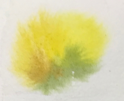
You see here a very blurry spot made with Lemon Yellow, Cadmium Yellow, Sap Green and Burnt Sienna. Before I applied any color, I laid down a large area of clear water—just enough water to make the paper surface look glossy but not puddly. (It’s always a little hard to describe in verbiage what degree of glossiness is just right, but if you practice, you will absorb this awareness almost without realizing it. So just go for it—see what happens!)
Working quickly, with a #16 or #20 round brush if you have one (if you don’t, that’s okay, use what you have), put some Lemon Yellow into the wet patch. Pick your paint up directly from the wells with your brush moist, but not saturated. No need to mix on the palette, as that tends to make your paint too watery. (You don’t want it gooey, either; again this is something you develop a feel for with experience). The amount of paint you add will be very much less than the amount of water that is already on the paper. This is so that there will be enough wet area for the color to spread without extending all the way to the dry area, and that will give you the fuzzy edges you see here.
Then into the Lemon Yellow you just put on, add a little Cadmium Yellow (in the example, it’s on the left). It makes a slightly more intense, warmer yellow, leaving the cooler Lemon Yellow to show on the upper right. And on the lower right add a little Sap Green, and then in the middle-to-lower left, a touch of Burnt Sienna. All this is happening while the area is wet, so you want to work quickly. Don’t stroke the paint. Just hit the water with your loaded brush and let it run and blend. You might get a bloom, but don’t worry about that. It will probably disappear after subsequent steps; and if it doesn’t, it will probably still look good.
Let this dry thoroughly.
STEP 2. Less Water, Bigger Color
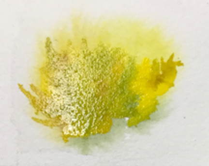
This time you are going to make a second layer on top of the first layer. This time, as before, you want to lay down clear water. Have a look at the image above. You see where I put my water, and that it’s quite glossy, yet it isn’t quite a puddle. It’s just about right when it looks like this. Once again you will add color to the clear-water area, working quickly. As before, your paint shouldn’t be watery, but neither should it be thick and gooey. As before, you want to drop in bits of color; here, I put down some Yellow Ochre, a little more Sap Green, and tiny bits of Burnt Sienna here and there. This time you need a brush with a good point, because with that point you dip into the paint you just put down and pull color out from the wet area into dry areas. When you do this, you create sharper shapes that suggest individual blades of grass and small groups of blades. Note that you now have two kinds of edges: soft, fuzzy ones as in Step 1, and now, crisp, sharp ones out where the paper was dry.
Let this dry.
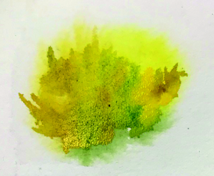
Step 3. Repeat Step 2.
In this step, as you can see from the image above, the wet areas will be in different places, and colors are different—otherwise you follow the same procedure of putting clear water over your dried paint and dropping in your color. Here I used mostly Sap Green, with touches of Burnt Sienna. Note again the qualities of the edges. Toward the bottom there is the suggestion of varied textures of growth, but there is no definition to speak of. This texture becomes sharper as it moves higher towards the defined blades of grass. So you have both indistinct, hazy edges as well as sharp, clean edges, and you can see how each work to allow your eye to see what is important.
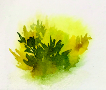
Working in successive layers, as has been done here, creates a feeling of volume and lushness. And the more of this effect you want, you keep adding layers. It can be a lot of fun to see what sorts of interesting effects you can create simply by layering washes and placing your colors strategically and artfully to make your sharp and soft edges. Try adding touches of other colors: Prussian Blue and Burnt Umber, used with restraint can make for a lot of rich texture and lovely effects. More of this will be coming soon!
OK, now go paint and have fun!