René Magritte said about his famous apple painting, “This is not an apple.”
Pablo Picasso said, “Art is a lie that makes us realize truth.”
Both were touching on the same point: that, as artists, we are illusionists. As we put paint on canvas, paper, board, or whatever, we want our viewer to see not paint, canvas, paper, board, or whatever, but rather, mountains, deserts, seas, flowers, trees, city streets, people, scenes of myth and history, intimate interiors, experiences, even personal diaries of mental collapse, as Van Gogh did so dramatically—creating beauty out of horror—and anything else a painter thinks worth painting: in short, truth.
So what we are going to look at now is how to create the truth of a landscape with an illusion of distance and space.
Let’s talk about that …
There are several ways of creating the appearance of distance and wide-open space. One is to make the colors more grey and soft as they recede into distance. Next time you are at a far-reaching vista point on a clear day, check this out. Let’s say you are looking at a view of some golden hills, a typical summer scene in California. The hills are dotted with bunchy-looking trees here and there, and covered with dry grasses. You might be seeing pretty much the same kind of vegetation over the whole distance, but notice how different it looks in the foreground as opposed to how it appears at the farthest point. Up close the grasses may be a subtle mixture of many different yellows, tans, browns, maybe a little green here and there, and you might even see bits of the dark earth the grasses are growing in. Now look out into the distance. Notice that the color becomes increasingly less bright the farther you look. It still looks yellow, but it isn’t as bright, and it might have a dusty look to it.
You can see the same effects when you look at mountains. At close range you discern lots of different objects, many shapes formed by light hitting some surfaces and not others, a huge variety of color. But as you look further and further into the distance, notice that the color changes. It becomes cooler and cooler as the distance recedes, losing first its yellow (warmest), then its red (also warm, but not as much), then you are left with a fuzzy bluish-grey.
Another way you can create the impression of near and far is by the level of detail you include. Look again at that California summer landscape. In your closest foreground, you can see many subtle details: trees are more clearly outlined and even small branches are discernable; lights and darks describe individual blades of grass; differences in size and color of plants depending on their variety and maturity. You might even be able to see seed pods, or insects. Now check out how this same stuff looks as it recedes into the distance. Fewer and fewer details can be differentiated the further into the distance you look, and if the distance is very great, you see no detail at all—only vague and fuzzy shapes.
Okay, now with that little bit of theory out of the way, let’s have at it!
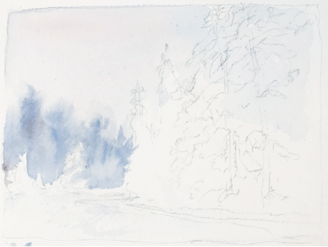
STEP 1. Here’s our reference photo. Have a careful look at it.
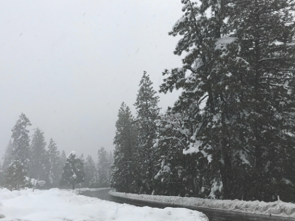
I made this photo last winter in the Sierra in a dense fog. This is actually a color photo, but as you can see, the fog was heavy enough to suck out every bit of color in this scene. But when I saw it, I thought it conveyed the principles I just set out above quite well, and thus would be a good example for us to use for practice creating a scene with significant distance in a painting.
STEP 2. Do a value study.
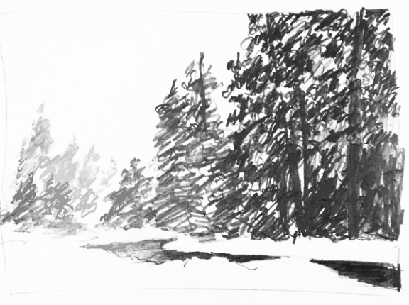
You can never go wrong starting any painting by making a value study. (For more on value, see “Practice the Basics Exercise 7: Value and Light Source”). I confess I don’t always take the time to make value studies, but I am never sorry when I do. In a piece like this, the value drawing is especially helpful because the scene is almost entirely lacking in color, and the success of the painting will depend on getting the values right.
Yes, you can look at your photo and tell yourself the snow is the lightest value, the big trees are the darkest value, and the rest are somewhere in between. But just as a pianist can think a C-scale, or even hum it, it does something different in the brain when the pianist puts hands and fingers on the piano and plays the actual scale. In the same way, you can think the values, but putting a pencil in your hand and drawing them is a different experience. Your eye/hand dance implants information in your brain you don’t get any other way.
Our value scale here has five levels from lightest (1) to darkest (5): the snow is Value 1 (the white of the paper); the sky is Value 2; the furthest background trees Value 3, the trees in front of those are Value 4; and the closest (darkest) ones Value 5. The road will have Value 3 on the left end, Value 5 on the right (running off the right-hand edge).
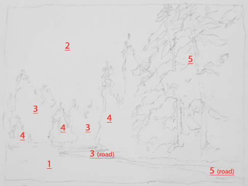
STEP 3. Map out the value areas in a contour drawing.
Oh no! Here’s another one of those artsy-fartsy words. Contour drawing?? What is that? Basically, a contour drawing is just an outline of an object or shape with little or no inner marks or details, just its outer contours. This is the kind of drawing you will do to begin your painting.
There’s a nerdy and fun kind of contour drawing call blind contour drawing. It’s nerdy because it’s a “thing” in academic art schools, and it’s fun because—well, it’s fun! What you do is look at an object, then close your eyes and without looking at it again, try to draw its outline. Of course, most of the time you are going to end up with something completely goofy—and good for a few laughs! So then you repeat the process. This time it will probably look better. And a third time? Pretty surely it’ll be better yet! Anyway, you get the idea. Point is, it’s another one of those things that really, really helps you see, understand, and even feel form and shape. (If you ever studied art as a discipline you might have done this in a class, but if you haven’t, try it out! See what happens!)
Well, so anyway, back to our contour drawing. As you can see below, I drew in only the outlines of the main areas and labeled them with those red numbers that represent the various values. You’ll notice that I put in some detail in the Value 5 area on the right. That’s because we are going to make a few snow patches, so part of the Value 5 area will not actually be Value 5.
STEP 4. Paint in Value 2.
Now we paint. As noted above, our reference photo is CMYK, not grey scale, although the look of the scene is definitely in a full spectrum of grey. We are going to retain the sense of the grey winterscape, but it’s not going to hurt that look if we add a little color, limited though our palette will be.
Color palette for this piece: Alizarin Crimson, French Ultramarine Blue, Cobalt Blue, Phthalo Blue, Burnt Umber, and Warm Sepia. You don’t need these exact colors. You can use whatever you have in your palette that is close enough to create nice neutrals (both warm and cool).
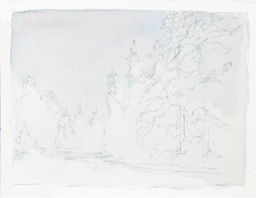
Value 2, which we are going to apply now, is just a little step away from the pure white of the paper (Value 1). You want to prepare a watery mix on your palette of French Ultramarine Blue and Burnt Sienna. My mix was more blue and less brown, so the mix is on the cool side. Now quickly apply the thin mix to that area labeled “2”, and while it is wet, you can add just the faintest hint of warmth with a little Alizarin Crimson. (Look carefully; you’ll see a little pinkish color in there).
Let this dry thoroughly.
Step 5. Add Value 3, the group of trees in the farthest distance.
This time you will make the same mix of French Ultramarine Blue and Burnt Sienna, but this time it’s not going to be quite as watery. Now with clear water, wet the area where your farthest group of trees will be, tracing carefully around the shapes of the trees in front of them (to create a sharp edge), and extending the wet patch well beyond where the tops of your trees will end. Remember what we noted above in the discussion about distance: that objects in a distant background have little detail, and their forms are soft and fuzzy. By making your initial watery patch big, you can put in a small amount of paint close to your defined edge, and then allow it to flow outward. Unless you added too much paint, it will stop flowing before it reaches the edge of the wet patch, and the outer edge will be soft.
Okay, now, let your paint dry.
Step 6. Paint the next layer of trees, Value 4.
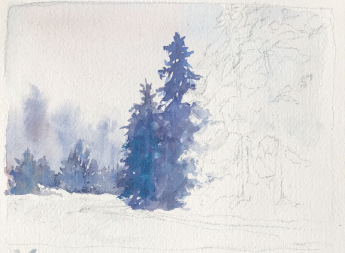
As in the previous step, you will make the French Ultramarine Blue and Burnt Sienna mix, with a little more density. This time you won’t wet the paper first, but instead paint directly on the paper, filling in all the Value 4 area. This group of trees is closer than the first group, so it will have more detail—in this case, clearly seen silhouettes. Now you can have a little fun by dropping in a bit extra color while the paint is still wet. I like to add colors that are very close to the original ones, just to add subtle variation. In this instance I dropped in Phthalo Blue and Alizarin Crimson in a couple of strategic spots.
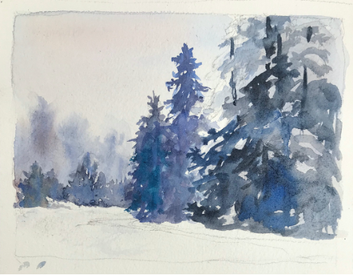
Step 7. You are ready for the foreground trees (and the fun begins…!)
Check out the four photos below. You’ll see how the big clump of trees in the foreground developed.
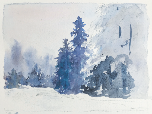
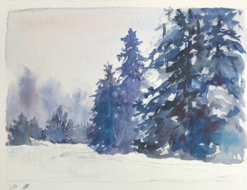
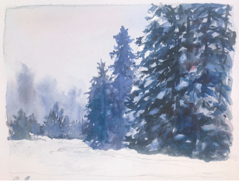
First there’s a light under-painting made with a wash similar to that first one you did for the sky. The rest is done in a way I call “painting messy”. Basically, it’s very unstructured, using all sorts of watercolor techniques. (Note: For more on techniques, see “Practice the Basics” on this website.) Wet-on-wet, wet-on-dry, “drawing” with the brush, a little lifting to make lighter patches that will suggest snow on some of the branches, painting around lighter areas with darker color (another way to make snow patches)—these are all used in the foreground trees. Colors can be blended in the same way as in the previous step—that is, closely related colors can be dropped into wet areas to suggest detail. Some of the sharper details were “drawn” in later, many with a darker and warmer color, Warm Sepia, and some with that same mix of French Ultramarine Blue and Burnt Sienna (but a lot less watery than any of the earlier mixes). These would be things like the pointy ends of branches; those dark branches that are front-most; and the trunks that peek in and out among the branches. You’ll also want to have most of the darkest color away from the outer edges, as the outer and upper branches are catching more light. Any time you want to add such sharp details and defined shapes on top of other paint, you’ll need to stop and let that paint dry.
“Painting messy” is a lot of fun, and you can surprise yourself when your brush produces a cool effect that you weren’t expecting or planning. It does take a little practice, and you might want to try it a little bit on some scrap paper before you apply it to your painting. And you might want to keep a wad of Kleenex or other soft material to pick up strokes you don’t like, (do this fast and “mistakes” will not be troublesome—but in truth, in this way of painting, not many of your strokes will truly be wrong, and the more you practice, the more you can predict what will happen!).
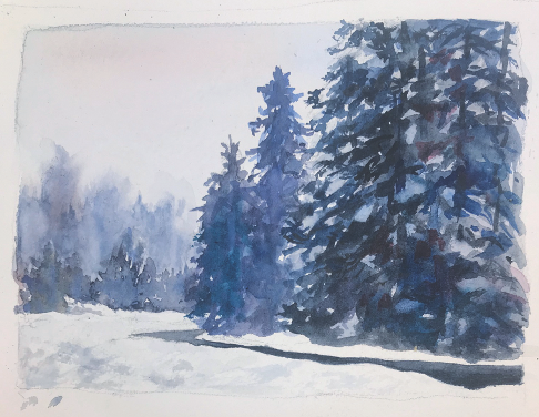
OK, last but not least, the road. This element makes this piece more interesting because it lends some contrast—the road is a relatively simple and sharp-edged form, with a smooth texture, as compared with the complexity and rough texture of the foliage. It’s quick and easy to make. Just wet the whole road with clear water, then drop your paint in. The only tricky part is to keep the clear water evenly distributed on the whole area. This will ensure that the color will go on evenly and create that smooth texture you want, and the edges will be clear and sharp where the road meets the snowy verges. That same French Ultramarine Blue/Burnt Sienna mix is fine, just add enough for Value 3 on the left side, and increase the amount of pigment toward the middle and right side. Work quickly. If the clear water is evenly applied, the paint will flow evenly. On the right side, you might want to heighten the effect by adding a dash of Warm Sepia to your wet paint.
Well, actually, the road is not quite last. The real last-but-not-least thing is to create some texture in the snow. Next time you see some snow, in a photo, or for real, have a good look at it. You will see right away that not a lot of it is pure white. There are shades of grey and blue all over the place. These color variations are what reveal the textures caused by the shape of the earth under the snow, and by disruptions of its surface—snowplows clearing a road, someone shoveling, animals making tracks, wind blowing it around, etc. To create these textures, it takes only a few little smudgy strokes. Pure cobalt blue is great for this—very light and watery. In a few strategic spots you can drop in a teeny bit of French Ultramarine and a teenier bit of Burnt Sienna The key to this is to make some of the smudges lighter and smaller, and some larger and darker. Some you add the extra color while wet, some added later on top of dry paint. You don’t need much of this. Just a few marks, and you’ll see believable texture emerging!
Okay, now, go play in the snow!