In this exercise you will be working with three sets of two complementary colors (recall from your color wheel exercise that the colors exactly opposite one another are the “complementaries”), and then mixing each set of two complementary colors in varying proportions. The object of the exercise is two-fold: 1) to observe how the two complementary colors affect one another, and 2) practice the different mixes.
It’s possible, and probably likely, that your first attempt at this exercise will not be easy, or necessarily as successful as you’d like. In that case, DO repeat the exercise. And repeat it again if you wish. Repeat as many times as you want…you’ll get better and better at it! And even if you get it perfect the first time, do it again, and see if your results are as great as the first time!
As you work, you might want to write down some notes, which you can make good use of when you repeat the exercise. They’ll also serve you as references in the future.
The descriptions I give are for the colors in my personal palette, which may or may not be the same as in your palette, but you should have equivalents available.
So here’s what to do:
Below you see three rows of colors: in the first row you have CADMIUM RED on the left side and SAP GREEN on the right side. In the second row you have LEMON YELLOW on the left and DIOXAZINE PURPLE on the right. In the third row, you have COBALT BLUE on the left, and WINSOR ORANGE (you can use CADMIUM ORANGE). In between the two ends there are five blocks of color that are mixes of the two end colors. As you move from left to right, the color on the left will contain more and more of the color on the right. In the first row, for instance, you see that the one right next to the CAD RED, is still quite red, but the one right next to the SAP GREEN is very green. Both are made with nothing but those two colors, but in very different proportions.
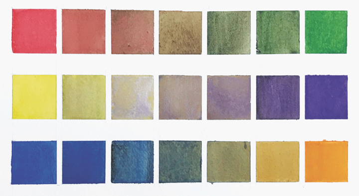
So now go ahead and set up your rows with the two end colors and blank squares in between. I like the look of squares, but they don’t have to be squares. They can be circles, or triangles, or big blotches. The important point, though, will be to have your colors in some kind of organized sequence, and at least five increments between the two end colors. Here I’ve made five intermediate mixes, but if you want to really challenge yourself, you can try 6 or even 7 intermediate mixes…see how subtle you can get!
Then start mixing. I like to start with the warm color (the left-side one), then keep adding the opposite color as I move across the row. Actually, in reality, you will no doubt need to remix, but this is yet another opportunity for practice…in this case, practice the ability to discern and compare warmth and coolness in your mixes. You will quite quickly, I think, become adept at evaluating your mixes…(and don’t worry, they don’t have to be perfect…but you WILL want them to be clearly moving from warm mix to cool mix as you move to the right across the row. In the first row, you’ll be putting mixes of CADMIUM RED and SAP GREEN; in the second, mixes of LEMON YELLOW and DIOXIZINE VIOLET; and in the third, mixes of COBALT BLUE and WINSOR (or CADMIUM) ORANGE.
BIG CAUTION!!! Use a LOT of restraint when mixing the VIOLET with the YELLOW. These two colors are the most extreme in terms of strength of their natural chromas. No matter how intense your yellow is, it is much less strong than the same degree of intensity in your violet. So it takes VERY LITTLE violet to alter the yellow.
Okay, then, that’s it! Have fun with this!