Two wonderful ways to work in watercolor is with the charging and glazing techniques. Here are two exercises that will help you understand and use these techniques.
Charging
Charging is the addition of color to wet paint. It’s also often referred to as “wet-into-wet” and “mixing on the paper”. One of its charms is that at some point, it forces you to relinquish control of the process (See “Before We Begin: Some Watercolor Philosophy”)
With practice you can learn to anticipate what your paint MIGHT do, but even then, there comes a point where you stop pushing your paint around and just let it, as I sometimes say, “paint itself”.
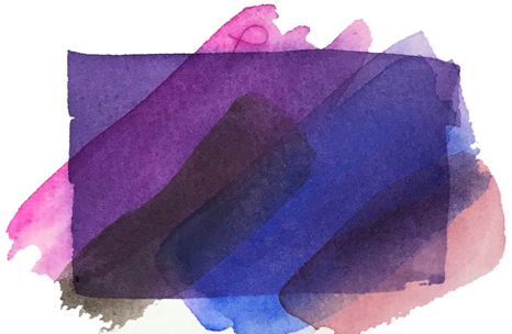
Step 1
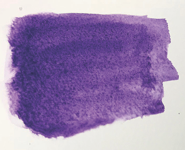
Lay down a wash like you see here. In the photo, the paint is wet enough that it has some gloss to it. Choose any color you like. I started here with dioxazine purple.
Step 2
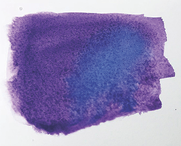
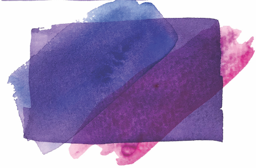
Before this first color has begun to dry, put another color on your brush and quickly drop it into the first color. (I used ultramarine blue here, and I dropped it into the right side of the purple). If you really want to get some really intense color, you can quickly gather up another brushload and add that into the same spot. Use no more than two or three strokes of your brush. Stop and let the paint move around on its own.
It’s important that your added colors are not too watery (yes, you are going to add more than one color in this exercise). What does this mean? That is, how watery is “watery”? I’m afraid I can’t really answer that in objective terms, but with practice and experimentation, you will soon develop a “feel” for what is the right amount.
One sure sign that you have used too much water and not enough paint is when you see those funny watermarks develop (those things we sometimes call “blooms”, “blossoms”, “cauliflowers”, “backwashes”). These blooms can actually be quite beautiful, and there are many times and places where you WANT them, but let’s not get ahead of ourselves. For now, let’s learn to avoid them.
Step 3
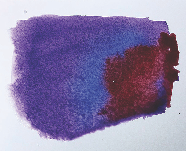
Again, while all this paint is still very wet (you are still working very quickly), drop in another color. This time, I used alizarin crimson. Be sure to keep it from blocking out the previously applied color. You want to see all your colors working together, so it’s important not to let any one of them overwhelm the others. Again, apply no more than just a couple of brush strokes, then stop and watch!
Step 4
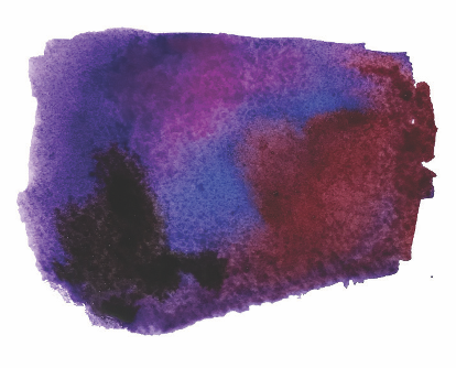
Why not get a little crazy! Here I added a blast of rose in the upper center region, and another blast of warm sepia in the lower left and just let them do their thing!
Okay. Now do the same exercise with some other colors. In this one I used analogous colors (that is, they are adjacent to one another on the color wheel), plus the neutral sepia. Try it again with different sets of analogous colors. And when you get bored with that, then you might try to do one with complementary colors. A fun way to do this is to start with a CLEAR wash area, then add the complementaries on opposite ends of that area. For example, drop a brushload of cadmium orange on one end, and a brushload of phthalo blue or cobalt blue on the other end, leaving a white area in the middle. You can watch the two colors move toward one another and see what happens when they meet in the middle. (If they don’t move quickly enough you can tip your paper back and forth a little—not too much, though, you want to try to keep the two colors clean at their respective ends).
Okay, that pretty much covers charging. Now let’s look at glazing.
Glazing
Glazing, like charging, is a technique for mixing and blending colors on your paper. The difference, however, is that you add each successive color when the previous layer is dry. (This technique is sometimes called “layering”).
Below you can see how glazing can deepen and intensify a color.
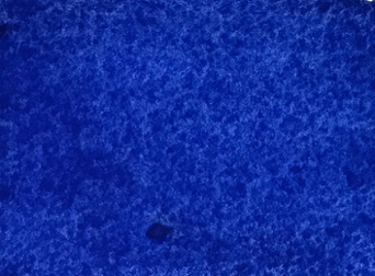
This is a single layer wash of ultramarine blue.
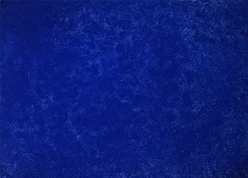
This is how it looks with a second layer on top of it. The blue is deeper, more intense, but you are still aware of the white paper underneath the color. This is a very good way to intensify your colors without their becoming too dense. What can happen if you try to get all that paint on in a single layer is that your color becomes opaque and gouache-like (gouache is also a water-based medium, and it has its own kind of beauty, but it is not transparent and we don’t want our transparent watercolors to look like that). Certain colors, and ultramarine blue is one of them, is very susceptible to becoming chalky and opaque if too much is applied at one time.
Okay, now for the exercise:
Step 1
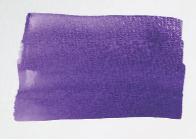
Lay down your wash. Again I have started with diox purple. Let the paint dry completely. (btw, while you must, of necessity, work quickly when you are using the charging technique, glazing is QUITE the opposite! You have to WAIT! It won’t work if you are impatient and too eager to get on with it!) So anyway…
Step 2

When the bottom layer is completely dry, apply another color on top of it. In this case I have used a stroke of ultramarine blue.
Step 3
When the second color is completely dry, put on a third one (here, I added rose). It’s kind of fun to notice how the underlying colors change the top color.
Step 4
Add some more! (But AGAIN, let the others dry first!) Here I have added a stroke of sepia, and a stroke of very diluted alizarin crimson. Notice how all the colors affect one another when they are layered in this way. You can get some interesting and subtle effects in the overlapped areas.
Again, experiment with other combinations of colors, and do include some with complementaries.
And HAVE FUN!